
First Impressions Matter, Here’s How to Nail Yours
Which exterior paint color is best? Your home’s exterior tells a story before anyone even walks through the door. Whether you’re sprucing things up for a sale or simply breathing new life into your property, choosing the right exterior paint colors is one of the most impactful decisions you can make. The perfect shade can boost curb appeal, reflect your personality, and even increase your home’s value.
But with endless color options and design trends, how do you choose the perfect paint palette that compliments your home’s style and surrounding environment?
This article will help you find out everything you need to know, from understanding architectural influences to testing swatches in daylight, selecting accent colors, and avoiding common paint mistakes.
Let’s dive into the color world and unlock the transformation your home deserves.
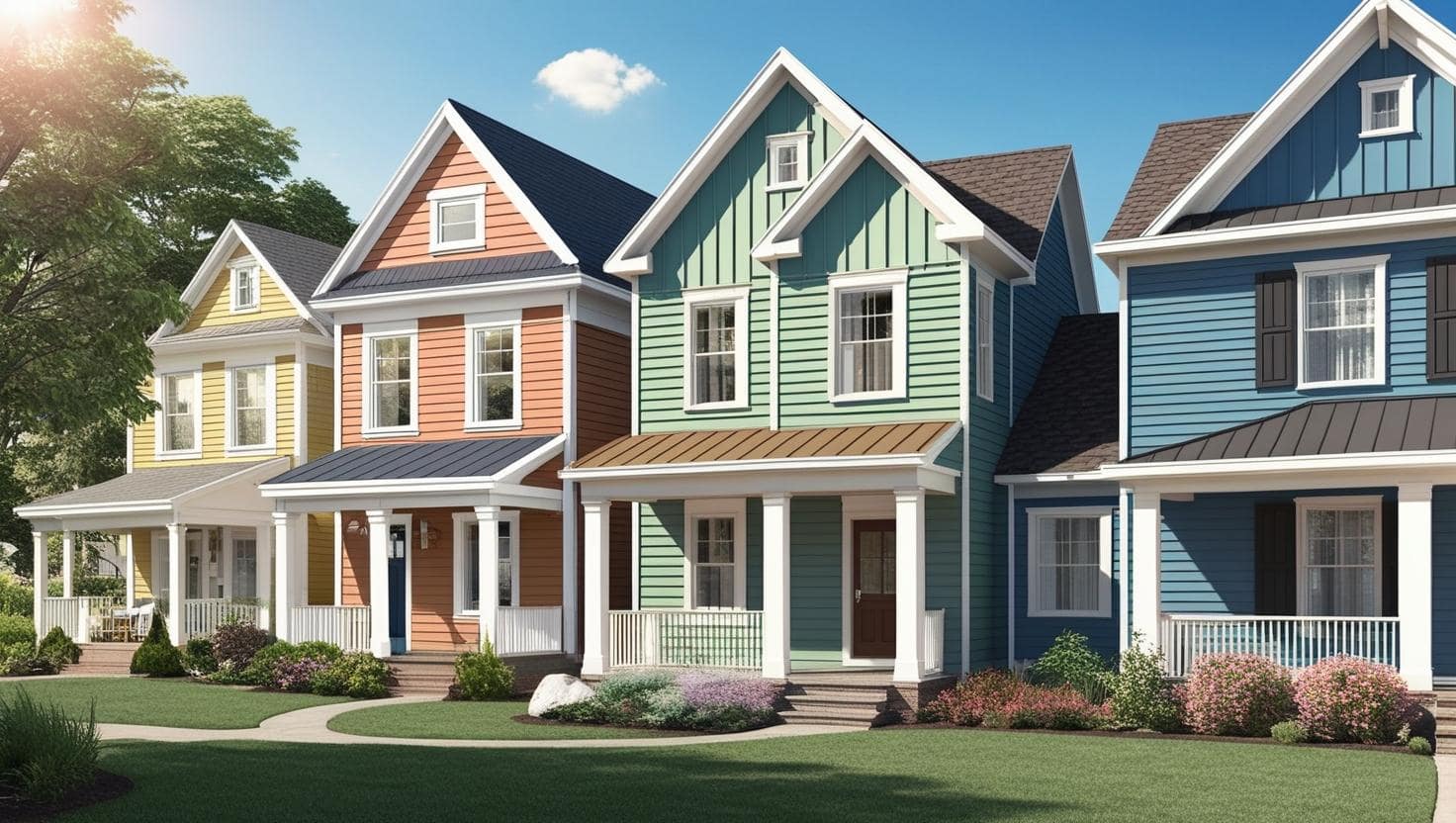
1. Know Your Home’s Architectural Style
Begin by looking at the style of your house. Every style has colors that naturally suit it. Matching your color choice to your home’s structure ensures cohesion and authenticity.
Here’s a quick guide to common styles and complementary paint suggestions:
- Victorian Homes: Embrace bold and historic tones such as deep greens, burgundy, and mustard yellow. Use contrasting trim colors to highlight ornate details.
- Modern and Mid-Century Modern Homes: Think clean and minimal, charcoal grays, white, black, and muted earth tones work beautifully.
- Colonial Homes: Stick with traditional and conservative palettes like white, navy blue, and warm grays.
- Craftsman Bungalows: These often look best with earthy shades like sage green, taupe, rust, and brown.
- Mediterranean-Style Homes: Choose warm terracottas, peach, sandy beige, and creamy whites to complement clay roof tiles and stucco walls.
- Cottage or Farmhouse Homes: Soft pastels, whites, dusty blue, and subtle greens enhance their charm.
👉 Related Post: How to Choose the Perfect Color Palette for Your Living Room
2. Observe and Respect the Surroundings
Your environment plays a big role in how your home’s paint color will be perceived. Take time to analyze:
- Neighborhood Aesthetics: While you want to stand out, going too bold might clash with surrounding homes. Balance creativity with community standards.
- Natural Landscape: A beach house suits seafoam greens or sandy beiges, while a home in a wooded area looks amazing in mossy green or deep brown.
- Climate Impact: Bright colors may fade faster in hot climates. Conversely, darker colors can absorb more heat, potentially raising energy costs in warmer regions.
Pro Tip: If your home is in a historic district or governed by a homeowner’s association (HOA), verify any restrictions or recommended palettes before proceeding.
3. Stick to the 60-30-10 Rule
This classic interior design rule applies just as effectively to your home’s exterior. It ensures a visually balanced and harmonious look.
- 60% Dominant Color: The main color for siding or major surfaces.
- 30% Secondary Color: Trim, garage doors, and porches.
- 10% Accent Color: Front door, shutters, railings, or flower boxes.
This combination gives depth, contrast, and character without overwhelming the eyes.
Example Palette for a Craftsman Bungalow:
- Main: Warm olive green
- Secondary: Cream or beige trim
- Accent: Burnt orange or muted red door
4. Factor in Fixed Elements
Your home’s permanent features, like roofing, stonework, brick, and pathways—play a huge role in your color decision. The wrong paint color can clash with these fixtures and ruin an otherwise beautiful home.
Coordinate colors accordingly:
- Gray shingles work with cool tones: navy blue, light gray, slate.
- Red brick pairs well with creams, forest green, or chocolate brown.
- Tan or brown roof looks great with warm beige, olive, or gold tones.
Helpful Tip: Take paint swatches outside and hold them next to these elements to visualize how they’ll interact in daylight.
5. Test Paints Before You Commit
Colors can appear dramatically different depending on lighting, time of day, and surface textures. Don’t skip this crucial step:
- Buy small sample pots in your top 2–3 choices.
- Paint large swatches (at least 2×2 feet) on different exterior walls.
- View them at various times: morning, noon, dusk, and under artificial light.
Avoid the mistake of painting your entire house based on a tiny swatch or just online previews. Testing prevents costly do-overs.
6. Explore Digital Visualization Tools
Many paint brands now offer online tools to help you visualize colors:
- Sherwin-Williams ColorSnap®
- Benjamin Moore Personal Color Viewer
- Behr Paint Your Place®
You can upload a photo of your actual home or use preloaded templates to try out different combinations in real-time.
This is especially useful when you’re torn between multiple palettes and need visual confirmation before committing.
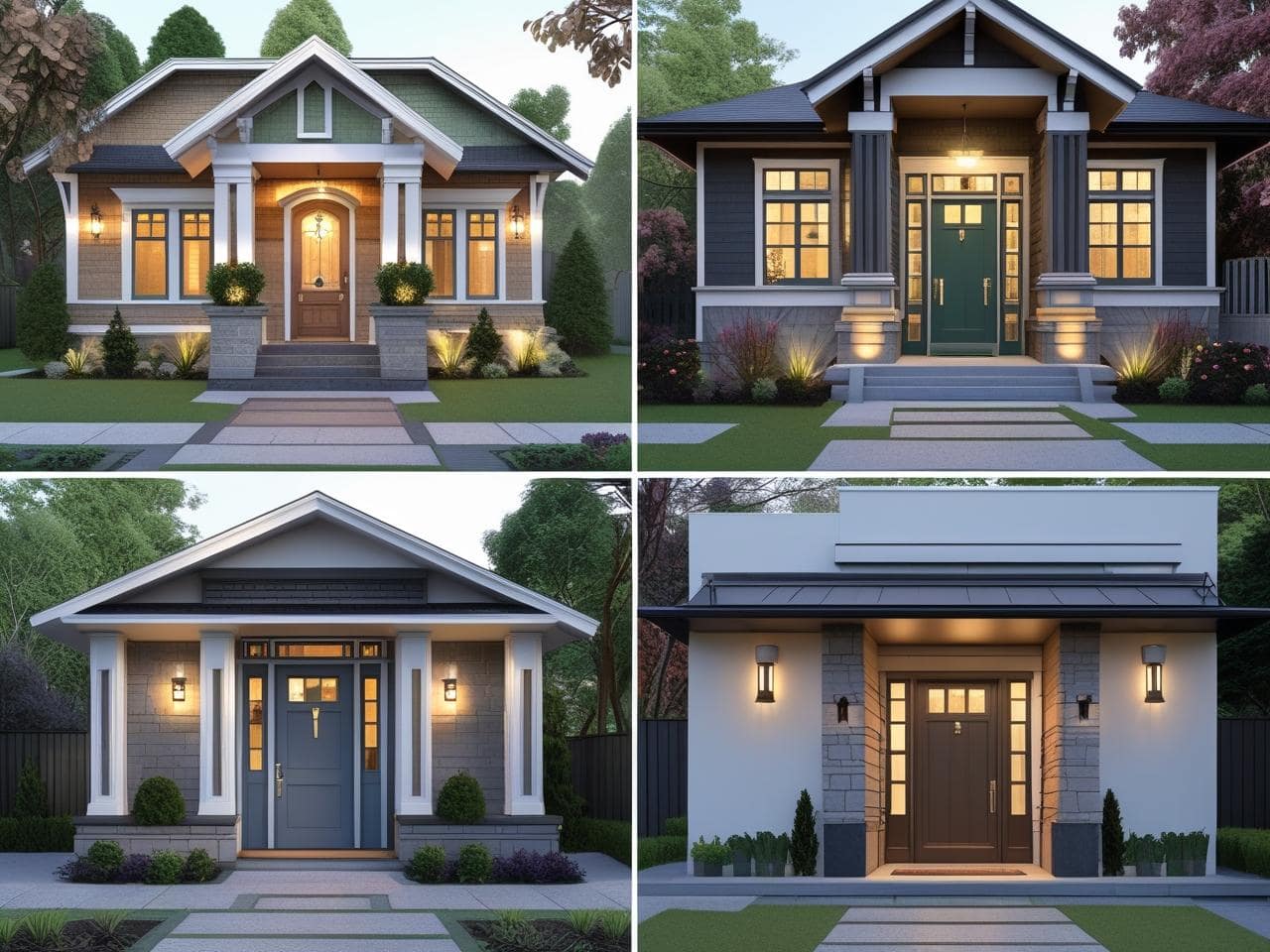
7. Make a Statement with the Front Door
Your front door is one of the most impactful features of your home’s exterior, and the perfect place to get bold and creative. Whether you go bright, dark, or cheerful, make sure it complements your trim and main siding color.
Popular Front Door Colors & What They Say:
- Red: Classic and welcoming
- Yellow: Joyful and optimistic
- Black: Bold, elegant, and modern
- Navy Blue: Calm, dependable, and traditional
- Green: Fresh, organic, and peaceful
Tip: A glossy finish adds elegance and makes your door stand out more.
8. Understand Color Psychology
Colors do more than just look good, they make people feel something. Use this to your advantage:
- Warm colors (reds, oranges, yellows): Inviting, energetic, and cheerful.
- Cool colors (blues, greens, grays): Calm, sophisticated, and peaceful.
- Neutral colors (white, beige, taupe): Timeless, clean, and versatile.
Understanding the psychology of color can help you choose a palette that not only fits your home, but also communicates the mood you want to set.
9. Look for Long-Term Appeal
Trendy colors may look stunning now but feel outdated in a few years. Opting for timeless colors ensures your home remains stylish and appealing longer.
Safe, elegant choices include:
- Greige (gray + beige)
- Navy blue with white trim
- Soft sage green
- Cream with black accents
Want to experiment with trends? Do so in smaller areas like the front door or planters, which are easier and cheaper to update.
10. Consult a Color Expert
If you’re feeling overwhelmed, don’t hesitate to hire a color consultant. Some professionals charge a small fee, but others are available through major paint retailers. A second opinion from an expert can help you avoid mistakes and bring out the best in your home.
Bonus Tip: Take photos of your house and surroundings when visiting a paint store. Consultants can use them to suggest the most harmonious shades.
Conclusion: Choosing the right paint can freshen up your home, boost its charm, and make it the one everyone notices. Whether you’re choosing colors for a modern bungalow, a classic colonial, or a charming cottage, the tips in this guide will help you confidently select a palette that brings your vision to life.
🎨 Ready to pick up the brush? Take your time, test thoughtfully, and trust your instincts.

i55en1
9ugbz9
rfqpj6
g2qqq8
dzw6p3
Thanks for sharing. I read many of your blog posts, cool, your blog is very good. https://accounts.binance.info/kz/register-person?ref=K8NFKJBQ
Perfect work you have done, this site is really cool with wonderful info .
Your point of view caught my eye and was very interesting. Thanks. I have a question for you.
gold strike casino
References:
https://maps.google.com.sl/url?q=https://fravito.fr/user/profile/2105355
jupiter casino gold coast
References:
http://bbs.medicalforum.cn/home.php?mod=space&uid=1899436
zuma slots
References:
https://avtovoprosi.ru/user/hellskirt15
emerald casino
References:
https://humanlove.stream/wiki/Online_Casino_Australia_Best_AU_Online_Casinos_2023
regent casino
References:
http://forum.maoshan73.com.hk/home.php?mod=space&uid=1185311
country club casino launceston
References:
https://maps.google.com.ar/url?q=https://www.folkd.com/submit/blackcoin.co/29_best-high-roller-casinos-2022-top-vip-programs-high-stakes-games_rewrite_1//
allslots
References:
https://images.google.bg/url?q=https://gaiaathome.eu/gaiaathome/show_user.php?userid=1717174
west virginia casinos
References:
https://firsturl.de/4D1LtHU
nu metro montecasino
References:
https://slonec.com/employer/10-best-online-casinos-in-australia-for-real-money-in-2025/
bally’s casino tunica
References:
https://156.67.26.0/jamelheine3356
casino luck
References:
https://wondermap.org/read-blog/9708_australian-open-2026-who-will-win-the-prize.html
blackjack game download
References:
https://git.kirasparkle.de/lanechurch609
osage casino sand springs
References:
https://gogs.551.com.tw/dewitteddie624
casino en france
References:
http://www.sa-live.com/merror.html?errortype=1&url=http://www.writemob.com//user/marmaiaaah
yukon gold casino
References:
http://kassi2.rosx.net/php/url.php?url=https://photo.menak.ru/user/sandirfbns
slots no download
References:
https://ticra.ru/user/malronlvpu
penny slots
References:
https://3d-hd.com/user/repriaihka
Sollten Sie hingegen ein Abenteuer ohne Echtgeld bevorzugen, bieten wir Ihnen mit unseren kostenlosen Testversionen die ideale Alternative! Schließlich bieten wir mit einem Sortiment von über 2000 digitalen Spielautomaten eine breite Auswahl von Slots aus nahezu jeder erdenklichen Kategorie. Klassische Freispiele werden häufig durch weitere Features ersetzt, die zufällig bei jeder Umdrehung ausgelöst werden können. Kein Wunder also, dass die Freude unserer Nutzer immer dann am größten ist, wenn neue Spielautomaten online vorgestellt werden. Sie existieren bereits seit mehreren Jahrzehnten und haben dementsprechend Kultstatus erhalten. Die hitnspin App steht sowohl für Android als auch für iOS zur Verfügung.
Das Casino bietet eine breite Palette von Zahlungsmöglichkeiten, darunter Kreditkarten, E-Wallets und Banküberweisungen. Das Hitnspin Casino boni sind vielfältig und umfassen Willkommenspakete, Einzahlungsboni und regelmäßige Promotionen für bestehende Spieler. Der Google Play Store bietet eine unkomplizierte Lösung für Spielbegeisterte. Im Hitnspin casino müssen Spieler wichtige Dokumente vorlegen. Im Hitnspin casino können Spieler Gewinne schnell und unkompliziert abheben.
References:
https://online-spielhallen.de/casino-bonus-ohne-einzahlung-2025-gratis-casino-boni/
danbury casino
References:
https://prpack.ru/user/julypvc14/
3d roulette
References:
https://www.google.com.ag/url?q=https://www.blurb.com/user/heightgame72
aspers casino
References:
https://www.nlvbang.com/home.php?mod=space&uid=2621926
stardust casino
References:
https://hangoutshelp.net/user/streetcold8
river casino chicago
References:
http://daoqiao.net/copydog/home.php?mod=space&uid=5125492
eucasino
References:
https://yogicentral.science/wiki/Experience_The_Best_Restaurants_In_Hobart
Regards for this post, I am a big fan of this web site would like to go on updated.
It is truly a great and useful piece of info. I¦m happy that you simply shared this useful information with us. Please stay us up to date like this. Thank you for sharing.
After study a few of the blog posts on your website now, and I truly like your way of blogging. I bookmarked it to my bookmark website list and will be checking back soon. Pls check out my web site as well and let me know what you think.
Hi! I know this is kinda off topic but I was wondering which blog platform are you using
for this website? I’m getting tired of WordPress because I’ve had issues with hackers and I’m looking at alternatives for another platform.
I would be great if you could point me in the direction of a good
platform.
This is the right blog for anyone who wants to find out about this topic. You realize so much its almost hard to argue with you (not that I actually would want…HaHa). You definitely put a new spin on a topic thats been written about for years. Great stuff, just great!
My partner and I stumbled over here from a different web page and thought I might as well check things out. I like what I see so now i’m following you. Look forward to going over your web page for a second time.
Thanks for sharing. I read many of your blog posts, cool, your blog is very good.
Enjoy Kado Bar Vape, where bold flavors meet smooth airflow, creating a flavorful, refreshing, and dependable vaping experience designed for convenience and satisfaction.
Great tremendous things here. I am very happy to look your article. Thank you so much and i’m taking a look forward to touch you. Will you please drop me a e-mail?
Heya i am for the first time here. I came across this board and I to find
It really useful & it helped me out a lot.
I am hoping to give one thing again and help others
like you helped me. https://portal.octopusrenewables.com/videochat-s-vebkam-devushkami-24-7-409/
Can you be more specific about the content of your article? After reading it, I still have some doubts. Hope you can help me.
Your point of view caught my eye and was very interesting. Thanks. I have a question for you.
Thank you for your sharing. I am worried that I lack creative ideas. It is your article that makes me full of hope. Thank you. But, I have a question, can you help me? https://www.binance.info/register?ref=JW3W4Y3A
Can you be more specific about the content of your article? After reading it, I still have some doubts. Hope you can help me.
Thank you for some other informative website. Where else may just I
am getting that type of info written in such an ideal method?
I have a challenge that I’m just now running on, and I’ve
been at the look out for such info. https://tumblr.com/seoquantum
Your article helped me a lot, is there any more related content? Thanks!
Your point of view caught my eye and was very interesting. Thanks. I have a question for you.
Thank you for your sharing. I am worried that I lack creative ideas. It is your article that makes me full of hope. Thank you. But, I have a question, can you help me?
Can you be more specific about the content of your article? After reading it, I still have some doubts. Hope you can help me.
Thanks for sharing. I read many of your blog posts, cool, your blog is very good. https://www.binance.com/vi/register?ref=MFN0EVO1